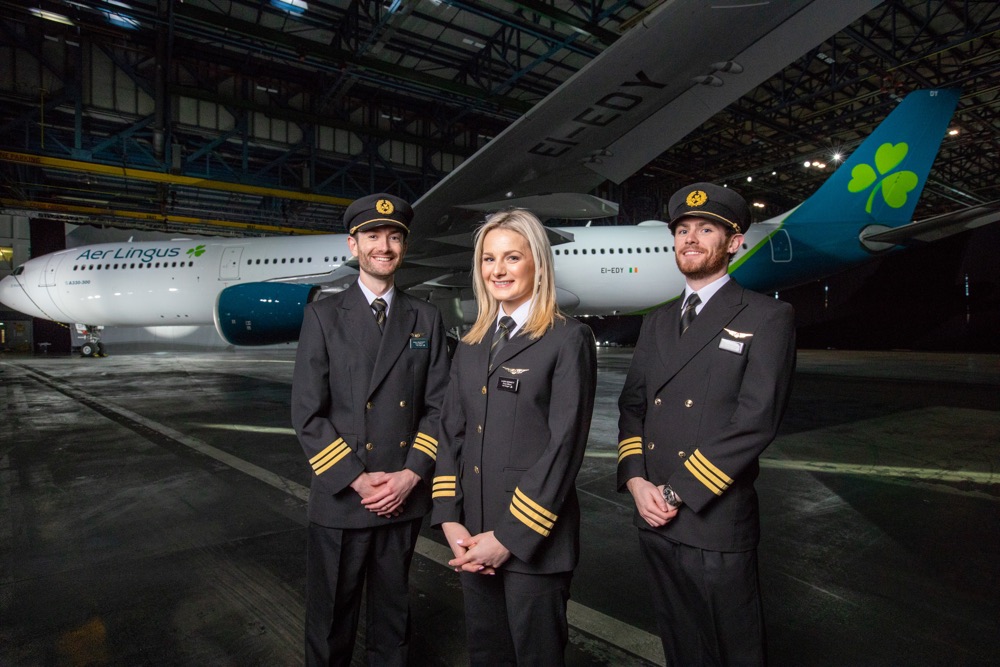
Aer Lingus has unveiled an updated and refreshed livery at an event in Dublin airport earlier today.
The company have updated their logo and all branding to give what they feel is a fresh look and feel to the company.
Here’s the new logo:
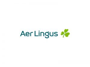
They’re still retaining the shamrock, which has always been a key part of their brand image, though the angle it’s at as well as the font have been changed.
Here’s how the logo has evolved to date:

The new branding will be rolled out across the entire Aer Lingus fleet as well as their check-in desks, website, apps and anywhere else where the logo appears.
Aer Lingus CEO Sean Doyle sees the brand refresh as welcome:
Aer Lingus is a modern Irish international success story, built on hard work, enterprise and the commitment of our people. We’re delighted to unveil our brand refresh today, which comes more than 20 years after Aer Lingus last invested in new brand livery, and reflects our position as a modern, contemporary airline. Aer Lingus has had exceptional success in recent years: adding new routes, new aircraft, new jobs and new opportunities for colleagues and guests alike.
What do you think?


Leave a Reply